
One identity that survived a marketplace launch
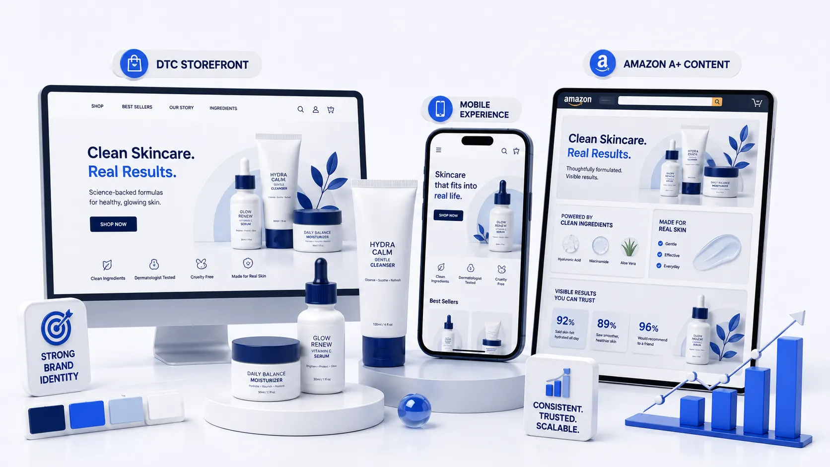
A skincare startup needed a brand that held together across a DTC storefront, Amazon A+ content and retail packaging. We built the identity, the design system and the full asset library in one engagement.
3 weeks
identity to launch
180+
assets in the library
+44%
PDP add-to-cart rate
The challenge
A pre-launch skincare brand with a hard retail deadline and three very different surfaces to satisfy: their own storefront, Amazon's rigid A+ module grid, and physical packaging with a print run booked.
Most identity work optimises for the website and then degrades everywhere else. Amazon's fixed aspect ratios and print's colour constraints would have broken a web-first system immediately.
What we did
Designed to the tightest constraint first
We started with the Amazon A+ grid and the packaging dieline, not the homepage. A system that survives a 970×600 module and a CMYK print run will always scale up to a website; the reverse rarely holds.
Built the identity as tokens
Colour, type scale, spacing and radius were defined once as tokens with documented mappings to hex, CMYK and Pantone. Nothing in the library uses a raw value.
Shipped a library, not a logo
180+ production-ready assets: A+ modules, PDP imagery, packaging artwork, social templates and a 24-page usage guide. The client's own designer works from it now.
Tested the PDP before the print run
We ran the two strongest hero-image directions against live traffic on the DTC store before committing to packaging, so the print decision had data behind it.
The outcome
Identity to full launch in three weeks, across all three surfaces, with no separate Amazon-specific redesign needed. The winning hero direction lifted PDP add-to-cart rate 44% over the initial concept.
Retail packaging shipped on the booked print date.
Tell us what's stuck.
We'll audit the account or the codebase, show you what we'd change, and only pitch if we think we can move the number.
Typically replies within one business day